Sanborns
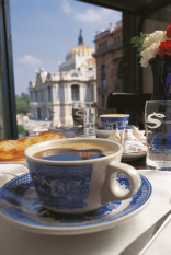
The concept that survives today and functions as a unique and different retail format in the world was created by Frank Sanborn: a specialized department store with a restaurant, bar and soda. Over time the library, magazines, tobacco, music cd´s and music devices were added. Traditional symbols of Sanborns were developed over the years such as the blue and white tableware with English design of Chinese origin, the uniform of the waitresses, the small blown-glass vases, handmade chocolates and pastries.
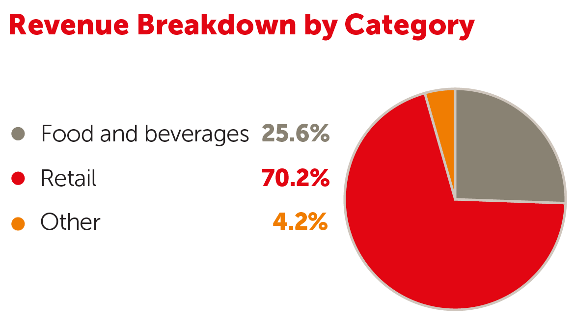 Sanborns remains a highly-successful unique retail concept in Mexico being a sales leader in multiple categories of products and services such as books, photography equipment, mobile phones and phone accessories, fragrances and cosmetics. It is also the second largest chain of bars and restaurants.
Currently the chain has over 167 stores and more than 256 thousand square meters of sales area, with a geographical distribution in 27 Mexican states and including 3 units in Central America.
The focus now is on reallocating spaces to higher value-added categories, increasing the number of private label credit cards, opening Sears-Sanborns combined stores and supporting sales through e-commerce.